

The Art of Data Visualization
For centuries it has been proven that humans are exceptional at processing complex information when it is presented in visual form. We’re able to perceive and distinguish between subtle variations in shape, size, position, orientation, hue, brightness, contrast etc. when viewing a visual representation of information, which may otherwise not be visible in a spreadsheet full of data as numbers and letters.

[Sankey Chart (custom visual in Power BI)]
Today, the concept of data visualization has found an important place in almost all businesses and professions. The corporate world not only uses visuals as an important presentation tool but depends on it for quick and accurate business decisions to remain competitive. With the ever-increasing pool of data accurate transformation, analysis and prediction is the demand of the hour for any organization to flourish. Thus, data visualization has become a necessity, rather than just a convenient and healthy practice for the corporate world.
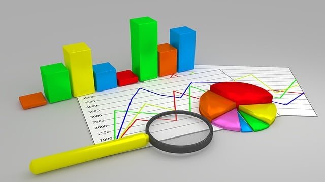
One of the biggest challenges in data visualization is deciding which visual should be used to best represent the information. To ensure that data visualizations have real business value, you need to understand how to graphically represent your data so that the message you’re trying to convey is immediately apparent to the audience. And to do this, you need to know which types of visualizations are best suited for a given data set. Analytics tool use intelligent auto charting to create the best possible visual of the given data set. This data exploration capability of tools decides whether to display the data in a pie chart or a bar graph, or a matrix or even maps.
But why limit ourselves to these visuals. The above visuals provide quick insights for large amounts of data, but accuracy and speed are not the only areas where data analysts focus today when visualizing data. They want to be more creative and imaginative and enable business users to see their data in a way that fits the business best. Sometimes to suit the different business use cases of different organizations, the given set of visuals are not effective enough or do not exactly convey the story as needed by the organization. That is when we need custom visuals to make our reports more effective. Thus, your analysis and reporting tool should be able to provide you this flexibility and the ease of incorporating and using your customized visuals in the tool.

Let’s take a scenario of a real estate company that is building a big residential campus divided into a number of blocks having a number of buildings. The company wants to track the status of each building and view other KPIs necessary for the completion of the project. Now this information can be effectively represented using a map visual, specially customized for the campus. The status of any building can be represented through pies and can be color coded, where different colors represent different statuses. When such a visual is shown to any business decision maker, with only a glance at the report, they can know the health of the project and the areas that need more work/improvements.

Custom visuals can also be used to make your reports more creative by adding some unique and fun elements into it. Let’s take another scenario where some teams are in a competition and a screen displays their performance constantly till the end of the competition. Now a bar graph or a pie chart are easy and effective visuals to display this information but now imagine a visual based on an aquarium (a custom visual in Power BI). The aquarium has as many fishes as the number of teams, of different colors, and the size of the fish varies according to the performance of the team the fish represents. If required, the name of the team can be written on the fish for more clarity. Now, this visual displayed on the screen make the competition more fun and healthy and the participants more interested.

With the ever-increasing pool of data, and our decreasing attention spans, we need our data to tell us our business story at a glance, thus making the task of reporting, challenging. Thus, we need tools like Power BI that makes data analysis easy and puts the power of visualization directly into the hands of end-users. It provides a store with numerous custom visuals to choose from and also provides the flexibility to add our own custom visuals (using R script) to it.

We live in an exciting, yet challenging time for data visualization. Today, data visualization has evolved into a blend of science and art that is certain to change the corporate landscape over the next few years. And we must change with it to be able to leverage this strong tool.


