

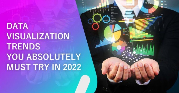
Data Visualization Trends You Absolutely Must Try in 2022
Data Visualisation is a powerful tool that can be used to uncover hidden insights. It is an amazing way to get at the truth and see things in ways you never could before. Data dashboarding is a great way to let your data do the talking, and newer tools and techniques are innovated regularly. In a world where data is king and information can be accessed on any device at any time - the need to harness this power has never been greater, but many businesses are still unaware of how they should approach visualizations in their own unique way! This blog discusses five trends that define the modern scene when it comes down to visualization techniques: Natural Language Querying (NLQ), Natural Language Generation (NLG), Advanced Statistical Visualization, Interactive Data Viz in Web Browsers, and Visualizing Real-time data.

Data Visualisation Trends to Keep An Eye Out for In 2022
Here are 5 data visualisation trends that are on the rise, and you absolutely must try to incorporate them into your work
Natural Language Querying Capability within BI Tools
By using machine learning and automation, NLQ makes the user interface more friendly and efficient, for it allows BI professionals and business users to ask questions in natural language- simple English- typed or spoken, as opposed to tediously writing it in code. It produces data visualization reports based on them. One of NLQ’s greatest advantages is that it doesn't require any particular training or expertise to use. It can easily deduce various insights from the data entered without a chance of error, which can be used to make profitable decisions for the business.

Natural Language Generation (NLG)
In simple terms, Natural Language Generation (NLG) refers to the ability of Artificial Intelligence (AI) to extract spoken or written narratives from the data that has been input. It implies that NLG allows data scientists and other users to feed difficult statistical data to a machine and receive well-analysed insights in simple English. Closely related to NLP and NLU, NLG focuses on the interaction between a human and a machine. The following six steps of NLG are also being recognised as one of the fastest-growing trends that support advanced data visualization:
1) Identifying fed data
2) Analysing data
3) Formulating document structure
4) Compose coherent sentences
5) Verify proper grammar
6) Final natural language presentation
Automated chatbots, voice assistants, summarising news reports, and the conversion of financial reports into easy-to-read documents for all stakeholders are all made much easier through NLG.

Advanced Visuals and Statistical Graphics
Gone are the days when traditional data visualisation techniques like bar graphs, pie charts, and maps could efficiently convey your business’s message to the audience. Now, more comprehensive techniques of data visualisation such as Sankey diagrams, violin plots, race bar charts, sunburst charts, etc., make up for the disadvantages of their traditional counterparts. They’re more representative, insightful, interactive, user-friendly, and aesthetically pleasing. What Dashboard Worx offers to you today is the need of the hour in a very fast, profit-oriented market: a way to produce such unrivalled data visuals and efficient statistical graphics on software that traditionally doesn’t facilitate such techniques in a matter of seconds.

Interactive Data Visualization in Web Browsers
Businesses today have the opportunity to visualise their data for the web using advanced techniques such as D3.js, also known as Data-driven Documents. D3 is a JavaScript library through which you can customise interactive data visualizations for the web. Other toolkits include Prefuse, Flare, and Protovis that can be used. D3 takes the lead as the more widely used and documented data visualization library, while Protovis is used for stagnant visualisations. D3 uses different formats suitable for web visualizations such as Arrays, Objects, CSV, JSON, XML, etc., to produce informative and beautiful designs compatible with a website.

Real-Time Data
Through the cloud-computing mechanism, companies now have the ability to view and transmit data in real-time from multiple locations at once. Real-time visualizations take visuals to a new level by letting us update charts/graphs of any kind on demand (in real-time). We have more information available so stakeholders will be able to come up with better solutions based off facts instead of guessing if something might work out okay. Businesses can now break the chain of waiting for the week/month to end to compute the results of their performance.
Realtime data visualization will have two core components 1) Stream of Data 2) User interface to access the stream of data through visualisations
Data streams are a useful way to monitor data that changes over time. It is a constant flow of data where data packets are sent whenever that data is updated. They can be used for weather forecasts, stock prices or revenue updates; pretty much any type of information you might want to be streamed in real-time and constantly updated with new values as they become available from each source's API
User interface - A real-time visualization of data requires a flexible, interactive user interface where changes are easily displayed based on what's going in the stream. To build such an interface you can use one of many programming libraries out there like D3js and WebGL.

We hope that this article has given you a peek into some of the hottest trends in data visualization. If you're not utilizing the latest trends in data visualization, your business may fall behind. With companies like Tableau providing services that allow for better visualisations and easier customization options than ever before with just a few clicks of a button on their software toolkit; it's time to take advantage!