

Top 7 Data Visualization Best Practices - Very insightful!
Do you want to create the ultimate, useful, intuitive data visual? Whether you are new to data visualization, familiar with it, or an expert, there is a lot to know besides how to use your favourite data visualization tool. There are best practices relating to the presentation of data in visual form that supersede the mechanics of tools like Tableau, QlikView, PowerBI, etc.
If you properly use visual features, you can “hack” your end-users’ brains without them even knowing it. Within the scientific world is a discipline known as cognitive psychology. It deals with the mental processes such as attention, perception, creativity, thinking, etc. One of the processes in that list is incredibly important to data visualization… perception. Perception is the process by which the human brain takes in external stimuli from its environment. More specific to our discussion, perception is the process by which the brain “sees” information in a dashboard.
Perception involves almost subconscious processing of visuals. There is very limited information that can be processed this way. Things such as position, colour (hue and intensity), alignment, size, and shape can be processed without conscious attention, known as pre-attentive processing. Other things cannot be processed pre-attentively. For example, text and numbers cannot be processed pre-attentively. These always require conscious focus to process.
What’s the difference? Quite a lot, actually. If you use pre-attentive visual features your end-users can process the information in 40-50 milliseconds, or even up to 200 milliseconds on the high end. If you don’t use pre-attentive visual features, like a crosstab, understanding can take considerably longer, directly dependent on the size of the crosstab.

Take a look at the image to the left… which shape is different and how long did it take you to see it? If you’re like the average person, it took you 40-50 milliseconds to spot the slanted shape.

And take a look at this image. Which one is different? Again, spotting the red one should have taken you about 40-50 milliseconds.
The word most laypeople will use for a highly pre-attentive data visual is “intuitive”. As in, “Can you believe how intuitive that dashboard Eric created is?” The ultimate dashboard is one where your end-user can look at it and understand what they need to know without even touching their mouse, or clicking on anything on their tablet.
Why go to all this trouble? Pre-attentive processing is a non-physical process (electrical, to be specific) within the human brain, meaning it doesn’t physically alter the brain; as opposed to attentive processing which requires physical changes in the synapses between neurons. To simplify this a bit, think of this metaphor… pre-attentive processing is a phone call, as opposed to attentive processing, which requires building the phone lines first, and then making the call. This makes a huge difference in terms of how rapidly your end-users will understand your visual.
Want to test your visual? Have an unrelated person stand back two or three feet and without touching your mouse or keyboard describe what they are seeing. Even if they don’t know the subject matter, they should be able to see things like, “it’s trending up over the last few years”, or “one of the products is selling way more than the others, but has pretty low profitability.” A complete neophyte would be able to see things like this in a well-designed dashboard! That should be your goal.
Best Practices
All of this is to define WHY best practices in data visualization are important. Presuming you are now a believer, here is a succinct list of the visualization best practices.
Have a Methodology
Define a process by which you obtain your design requirements, obtain your data, design visuals, and release them. Only a well-defined methodology will ensure continuous quality improvement and consistent quality in your data visuals. To this end we use UD³ -Unilytics Dashboard Design & Development - methodology to ensure all elements critical to the creation of highly effective dashboards are addressed.
Know Your Audience
Not all end-users will perceive the same information the same way. For example, on a profitability dashboard a Sales Manager and a Chief Financial Officer will have very different ways of understanding profitability. Make sure you answer the question properly for their perspective.
Define Resulting Actions
What actions would you expect your end-users might take after they look at your dashboard? The action may even be “nothing” in the event the dashboard indicates everything is progressing fine. For example, if it’s a dashboard on manufacturing defects, it’s reasonable to think your end-users might need to go talk to an operator or inspect a specific machine if the defect rate suddenly increases.
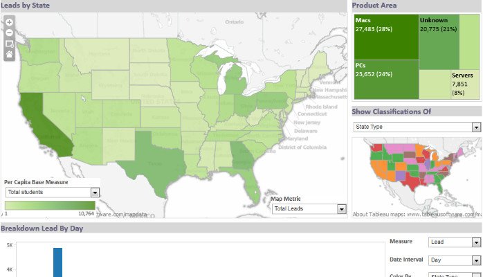
Classify Your Dashboard
There are three types of dashboards: operational, strategic/executive, and analytical. Know what each one is, general traits of each, and classify your dashboard as one of these three. This will help guide your initial design decisions. Here’s a brief definition of each type of dashboard:
• Operational Dashboards – A regularly updated answer to a question or line of inquiry that frequently monitors operational concerns in response to events or on an ad-hoc basis.
• Strategic/Executive – A high level view of a question or line of inquiry that is usually answered in a routine, specific way and usually presents KPIs in a minimally interactive way.
• Analytical – A highly interactive view that provides a variety of investigative approaches to a specific central topic with a few corollary contextual views.Profile Your Data
There are three types of data: categorical, ordinal, and quantitative. Different visual features work better with different types of data. For example, scatter plots work well with two pieces of quantitative data, whereas line charts work best for date ordinal data… conversely line charts are a poor choice for (non-ordinal) categorical data as line charts imply continuity. Make sure you know what data your visual will be using. Here’s a brief definition of each type of data:
• Categorical – Data that logically belongs together, such as: North America, Europe, and Asia.
• Ordinal – Data that logically belongs together and has a logical sequence: gold, silver, and bronze medals.
• Quantitative – Data that defines “how much” of something there is: $1 million in sales, 20° Celsius, 150 defects.Use Visual Features Properly
There is a hierarchy of effective visual features based on the type of data. Know this hierarchy and apply it. This isn’t just some product manager’s preference… this is based on hard science involving decades of research, studies, and physiological measurement (e.g., PET and fMRI scans of the brain).
Apply the effectiveness hierarchy with the type of data and avoid common mistakes in using visual features. For example, applying discrete colours to categorical data is a common mistake visualizers make. Here is the final word on effective visual principles based on the type of data…
Design Iteratively
Don’t wait until your requirements are 100% understood. Visualization requires an understanding of the visual concept your end-users have conceived and your ability to understand their visual needs. This is a notoriously difficult thing to accomplish, so don’t wait around to try and ensure you have a 100% agreement between you and your end users. Get a big chunk of the requirements then start designing proofs of concept and prototypes, elicit feedback in an interactive setting, and revise your visual with direct interaction with your end-user. This will avoid “analysis paralysis” which tends to happen to those familiar with older project management approaches.
Conclusion
So there we have it. A short introduction to best practices in visualizing data. There is a LOT more information that could be included here, but then it would be a white paper, not a blog. In fact, Unilytics offers an entire two-day course that goes over visual best practices and optimal dashboard design, so a short blog like this can only present so much information.
Hopefully you find this useful and a good place to start.


